We’re creating a new curriculum that reduces the workload on church staff by equipping lay people to minister to their friends. And last week, we asked you to evaluate which of the following logo designs you liked best.
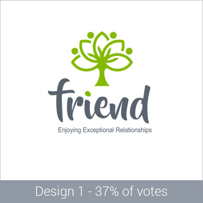
We had over 700 responses. Here’s the design that received the most votes:
Logo survey results

And here’s how many votes the other designs received:
Your comments were helpful
Thanks again for voting and to everyone who shared additional comments about the designs. It was helpful to hear why you chose the options you did. A repeated comment was that the designs were too feminine—that they wouldn’t appeal to men. I had the same thought. So, I heard you, and we’re on the same page. I definitely want a look and feel that draws men and women to this program. We can address that by tweaking the colors and the fonts in the logo.
Next step? We’ll continue working with the designers to refine their submissions based upon your feedback and our observations and goals.
Thanks for your help! I’ll keep you posted on our progress.


